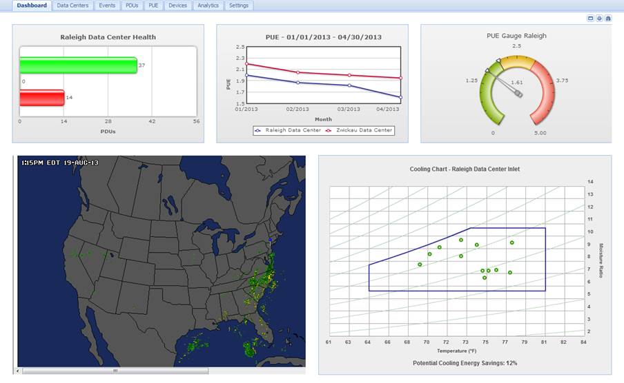
Dashboards are often used by businesses to give an at-a-glance view of the current status and historical trends of an organization’s key performance indicators (KPIs). This view is often in graphical format, enabling users to easily decipher the information for informed decision making.
A good DCIM solution provides users with the ability to easily review the state and performance of their data center from a single pane of glass. But what if you want to monitor more than one data center? Or have multiple slices of information that can be presented? Can you display more than one dashboard at a time?
With Sunbird’s dashboard, users can customize groups of charts and widgets in a single view, create multiple versions of dashboards, and select which ones to view. You’re even able to proudly display your data center accomplishments by playing a slide show of your dashboards on a large NOC screen.
Sunbird’s DCIM solution allows you to easily configure more than one version of a dashboard or report. Simply drag and drop the selected widget onto the dashboard layout screen. Other users are also able to share their dashboards with you, facilitating collaboration. A web based GUI can be used to change size, add titles, and select the parameters for your widgets. The finished dashboards can be printed or saved for later retrieval.
Sunbird’s DCIM solution offers a variety of widgets including:
- Active Events: Shows the ten highest-severity active events in a list.
- Device Chart: Displays a default setting of average active power over the past twenty-four hours.
- PDU Health Chart: Shows overall health, which includes connectivity and/or active events. You can also set the chart to include all PDUs in the system, or just the PDUs in a specific level of a data center.
- Capacity Forecast Chart: Determines maximum active power of a data center. Based on the capacity settings, the chart displays how many days of supply remain before your data center reaches capacity, or indicates that you have adequate capacity.
- Capacity Gauge: Shows how much power a selected node of your data center has consumed over a specified time period.
- Cooling Chart: Enables you to compare your data center’s sensor readings against industry recommendations and display your data center’s humidity and temperature readings on a psychrometric chart against ASHRAE recommendations.
- PUE Trend Chart: Shows how your data center’s PUE has changed over a given time period. Daily or monthly calculations may be used.
- Latest PUE Reading Gauge: See where your data center’s PUE falls in the threshold range you have configured.
- Facilities Chart: Displays active power or energy readings for one or more facilities objects such as: CRACs, floor PDUs, floor UPS, power panels, or standalone meters.
For those that require custom dashboards or are simply adventurous, even HTML and image widgets can be created.
Have questions on how you can best customize your dashboards to get the most out of your DCIM? Or want to share your dashboard? Contact us at [email protected]


